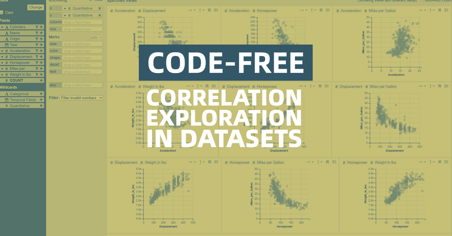
TLDR; What is data voyager 2?

It’s a browser-based app, that allows you to upload your dataset, and search for correlation in visualisations of the data.
Instead of producing randomly many correlation charts and metrics manually, you have instant access to all correlations possible in your dataset
 

Quick tour

 
ABSTRACT: Visual data analysis involves both open-ended and focused exploration. Manual chart specification tools support question answering but are often tedious for early-stage exploration where systematic data coverage is needed. Visualization recommenders can encourage broad coverage, but irrelevant suggestions may distract users once they commit to specific questions. We present Voyager 2, a mixed-initiative system that blends manual and automated chart specifications to help analysts engage in both open-ended exploration and targeted question answering. We contribute two partial specification interfaces: wildcards let users specify multiple charts in parallel, while related views suggest visualizations relevant to the currently specified chart. We present our interface design and applications of the CompassQL visualization query language to enable these interfaces. In a controlled study, we find that Voyager 2 leads to increased data field coverage compared to a traditional specification tool, while still allowing analysts to flexibly drill down and answer specific questions. source: UW Interactive Data Lab | Papers (washington.edu)


badge